All-Access
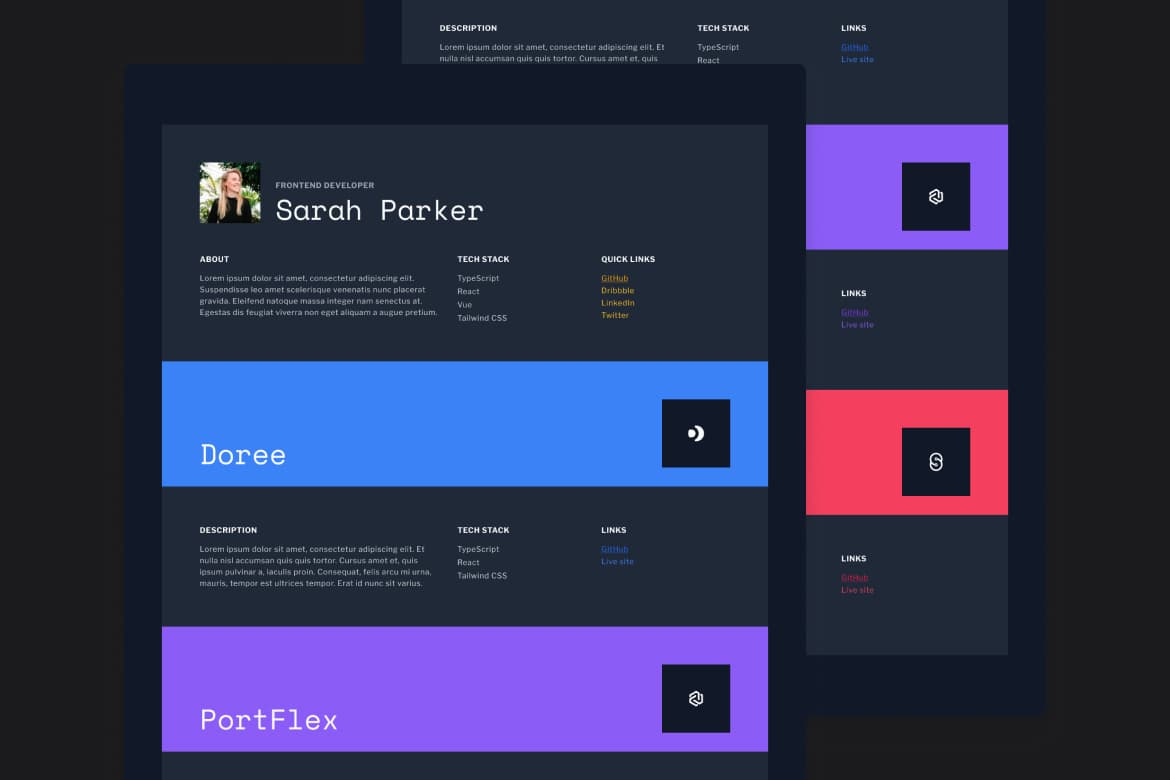
Developer portfolio with Next.js and Tailwind CSS
Solution for Developer portfolio

Hunter Becton

Next.js
Tailwind CSS
Notes
What did you learn while working on this solution?
I’m still learning Tailwind CSS, and I was skeptical at first, but I can’t deny how much faster it feels to style my projects. The utility-first approach of Tailwind CSS significantly sped up the styling process, allowing me to quickly implement responsive and consistent designs.
What would you do differently if you had to solve this challenge again, and why?
I’d like to do something fun with the cursor when it enters a new section of the portfolio. Maybe it could change colors or change the cursor entirely. I think adding an interactive element could add a touch of personality and make the portfolio more engaging and memorable.
Did you try any new approaches or technologies in this challenge? What was that experience like?
The layout was a fun challenge. It’s always enjoyable using CSS Flexbox and CSS Grid together.