React
CSS
Vite
Notes
What did you learn while working on this solution?
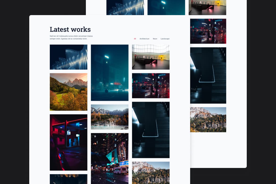
I learned how to create a simple filter function with React, which was a great way to manage the visibility of images based on selected themes. I also realized how complex creating a masonry grid can be with CSS, requiring careful consideration of layout and image aspect ratios to ensure a cohesive and visually appealing design.
What would you do differently if you had to solve this challenge again, and why?
The filter feature feels basic, so if I had to solve this challenge again, I would like to add animations for when images are filtered. Adding animations would provide a smoother, more visually appealing user experience.
Did you try any new approaches or technologies in this challenge? What was that experience like?
I was surprised how complicated creating a masonry grid is with CSS. There are some proposed solutions for masonry layouts, but right now one of the best options is using CSS columns. I don't use columns often, but it made sense for this project and provided an effective way to achieve the desired layout. It was a valuable learning experience and highlighted the versatility of CSS for complex designs.
