Free
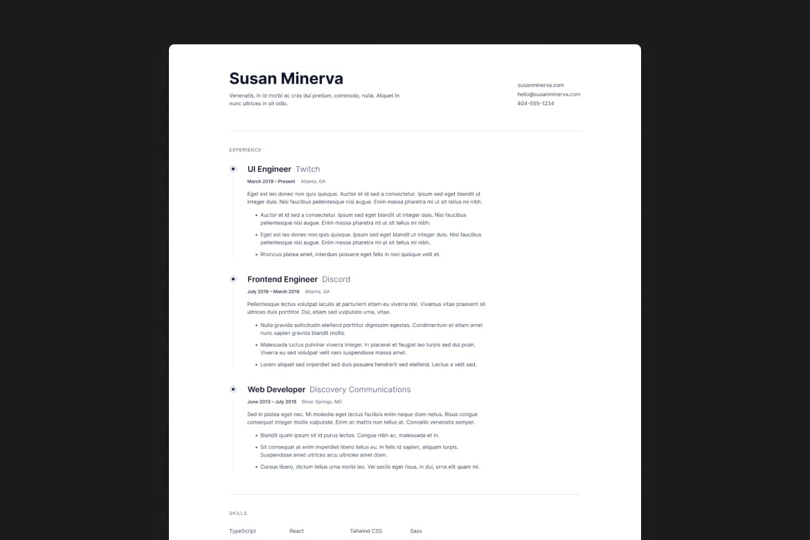
Professional resume with HTML and CSS

Hunter Becton
HTML
CSS

SvelteKit
CSS
I enjoyed working on the UI element with the bullet point and the centered line going down from the bottom. At first, I wasn't sure how I'd approach this, but the solution was quite simple using flexbox and borders. This experience reinforced how versatile and powerful CSS can be for creating intricate design elements.
I think SvelteKit is a bit of overkill for such a simple site, but the extra practice while learning this new framework was worth it. If I had to do it again, I might consider using plain HTML and CSS for simplicity, but the learning experience with SvelteKit was definitely valuable.
Nothing new here besides the bullet point design mentioned above. It's always surprising how handy flexbox can be. The flexibility and ease of use that flexbox provides made it simple to achieve the desired layout and styling, showcasing once again its effectiveness in responsive design.